Where past and future meet.


The Brief
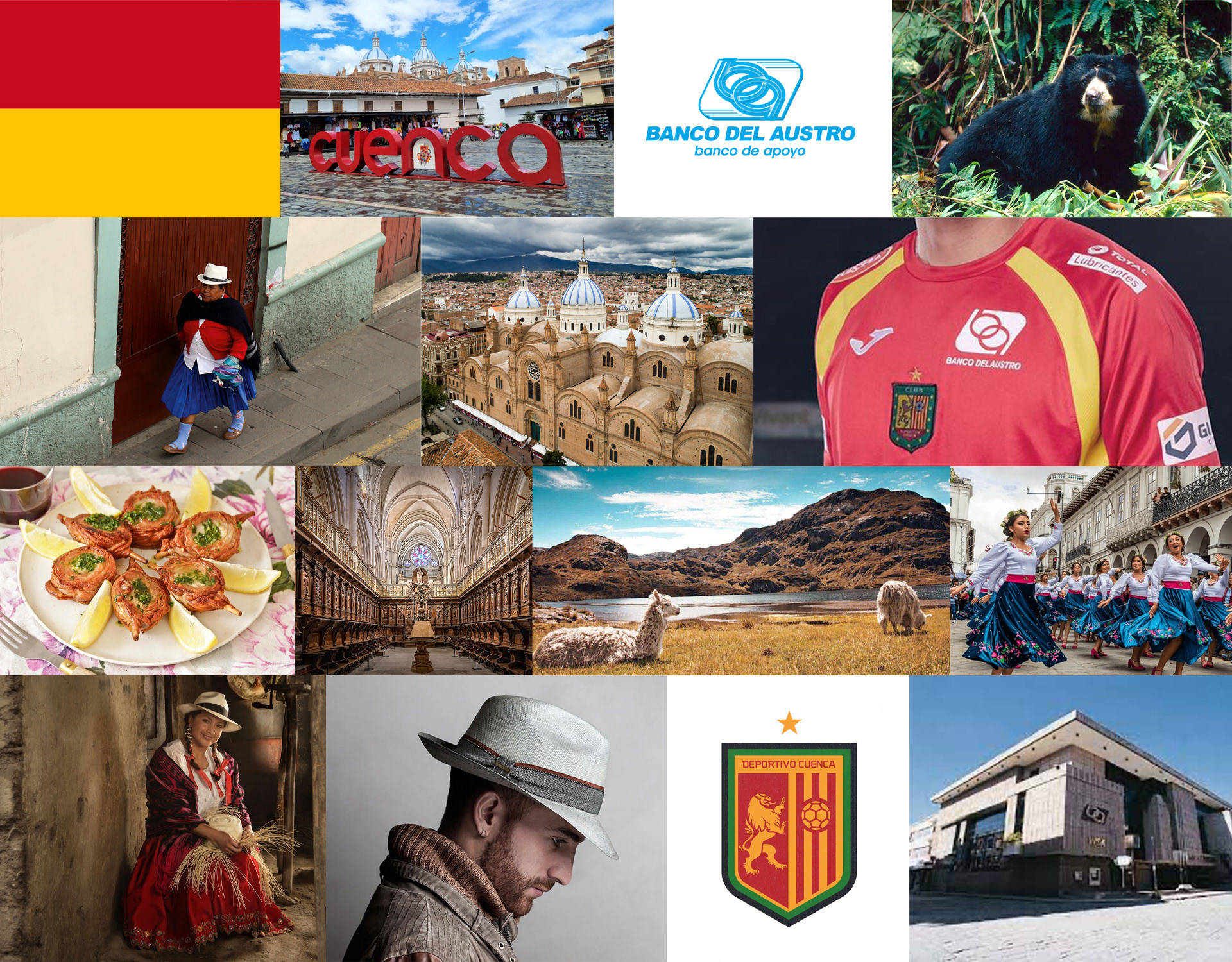
Banco del Austro, founded in Cuenca in southern Ecuador, has long been a trusted financial institution, known for its strong community ties. As the main supporter of local businesses, it helps empower entrepreneurs, families and even the city soccer team, Deportivo Cuenca, by sponsoring them.
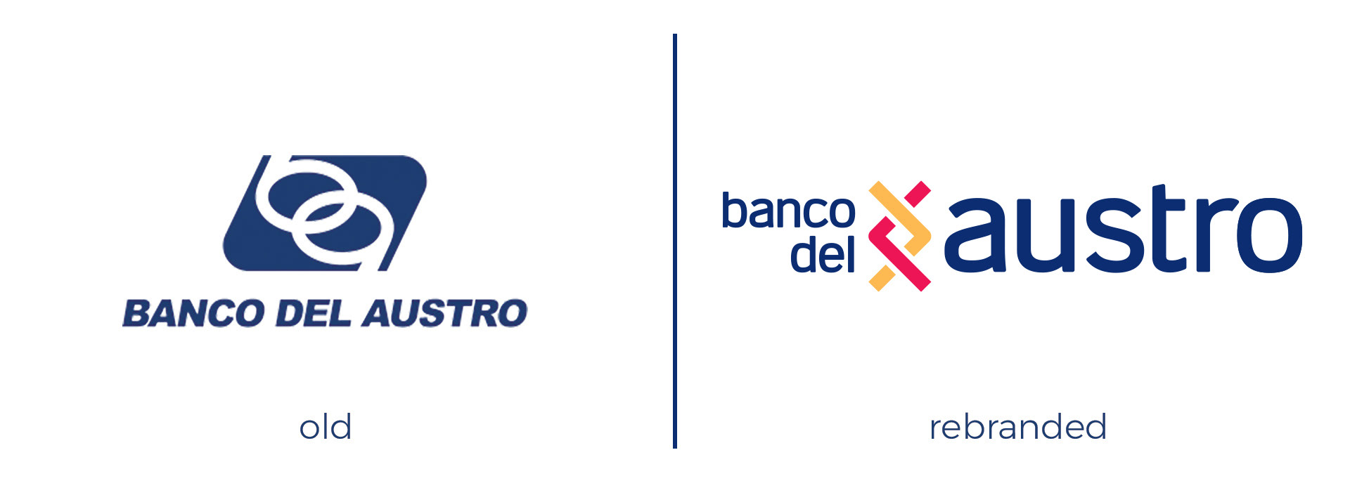
As the bank’s goals grew and market demands evolved, its previous monogram logo no longer reflected its vision. To address this, they partnered with the design team at Y&R to create a refreshed identity.
Banco del Austro, founded in Cuenca in southern Ecuador, has long been a trusted financial institution, known for its strong community ties. As the main supporter of local businesses, it helps empower entrepreneurs, families and even the city soccer team, Deportivo Cuenca, by sponsoring them.
As the bank’s goals grew and market demands evolved, its previous monogram logo no longer reflected its vision. To address this, they partnered with the design team at Y&R to create a refreshed identity.

The Strategy
Research from the BAV Group revealed the new brand had to emphasize tradition and trust while avoiding an outdated look. The challenge was to honor Cuenca’s heritage and culture while also projecting the bank into the future.
Research from the BAV Group revealed the new brand had to emphasize tradition and trust while avoiding an outdated look. The challenge was to honor Cuenca’s heritage and culture while also projecting the bank into the future.
The Concept
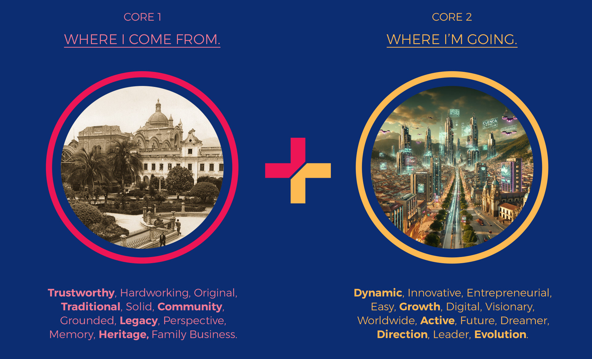
Guided by insights and keywords derived from research, we arrived at the core concept “Where I come from. Where I’m going.”. A clear idea that represents how the bank’s heritage could shake hands with its future aspirations.
Guided by insights and keywords derived from research, we arrived at the core concept “Where I come from. Where I’m going.”. A clear idea that represents how the bank’s heritage could shake hands with its future aspirations.
The Process
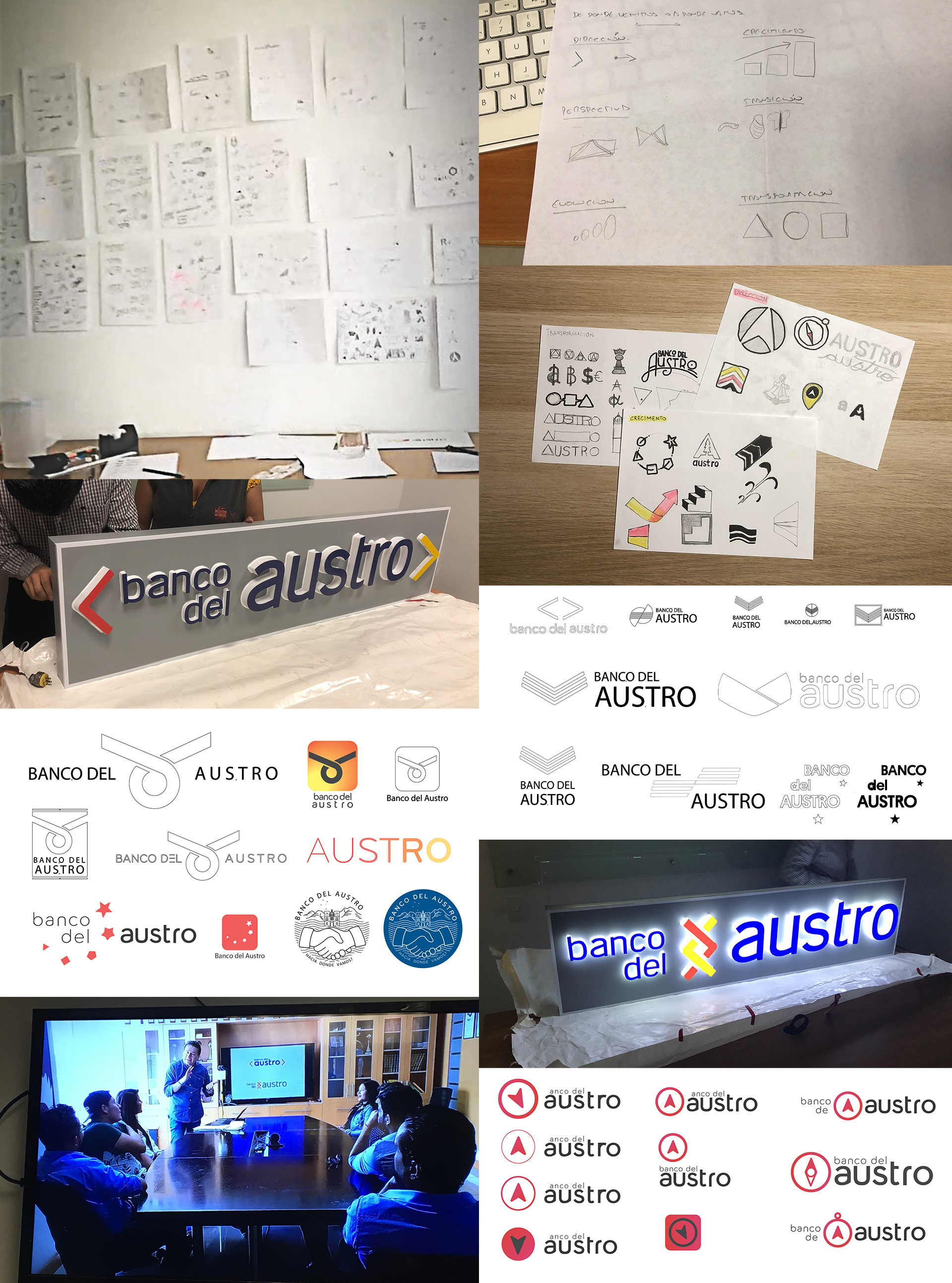
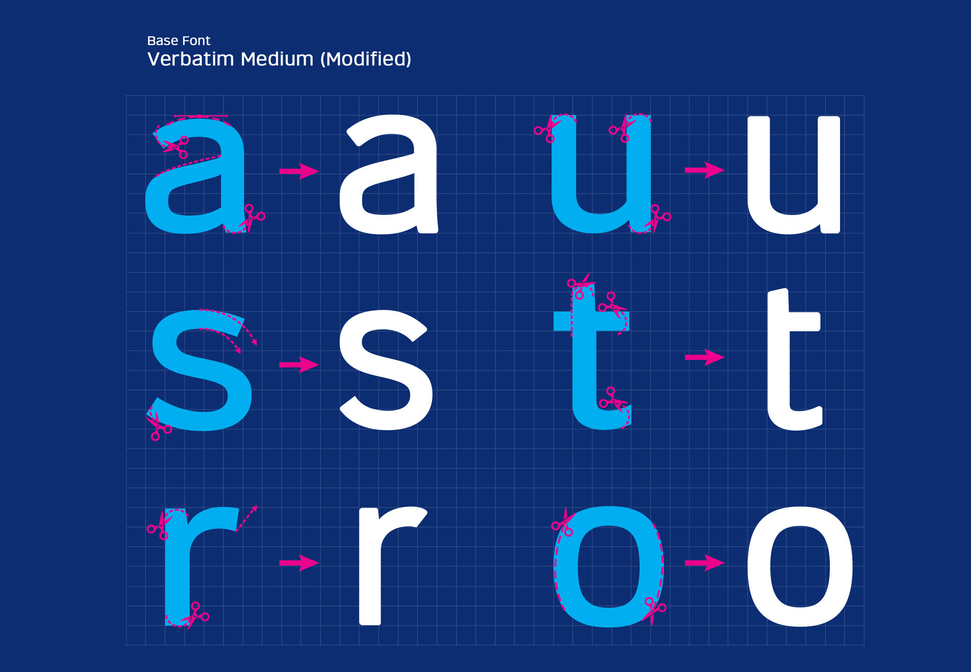
It all began with hand sketches that evolved into digital variations. Through iterative design and focus group feedback, we refined the work into a solution that honors the bank’s legacy while meeting the needs of a digital, evolving market.
It all began with hand sketches that evolved into digital variations. Through iterative design and focus group feedback, we refined the work into a solution that honors the bank’s legacy while meeting the needs of a digital, evolving market.
The New Brand
The chosen design features:
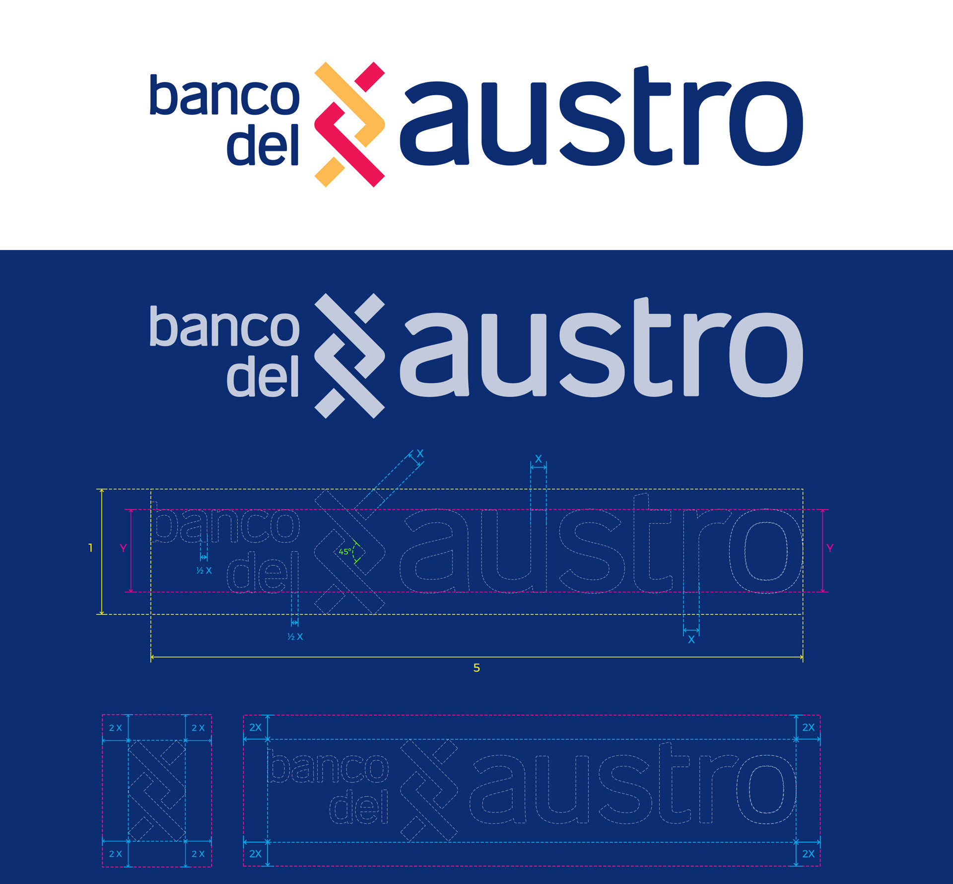
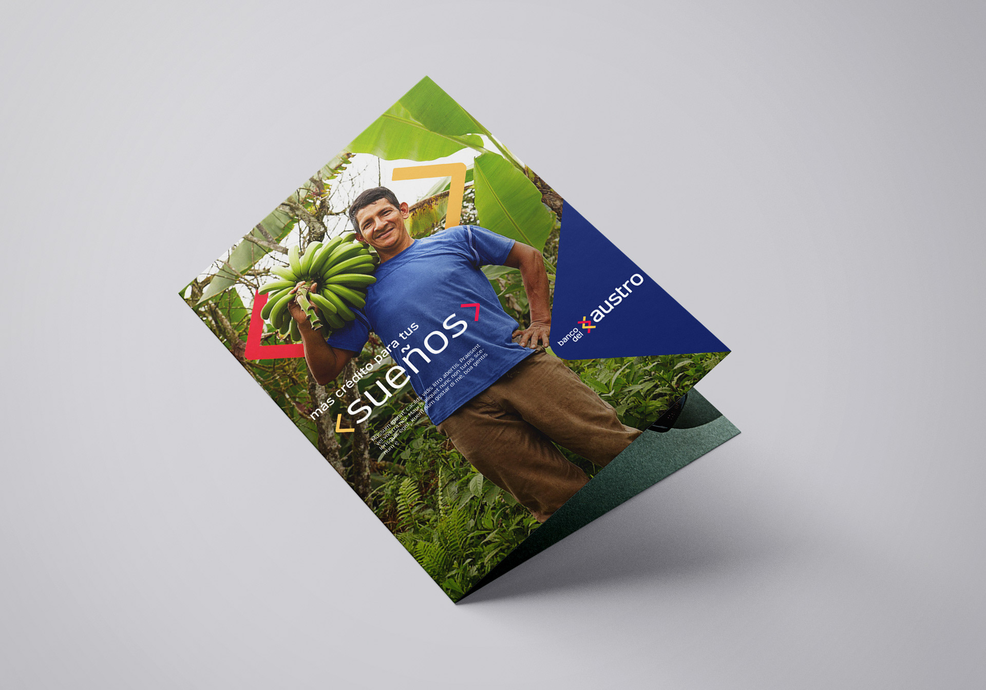
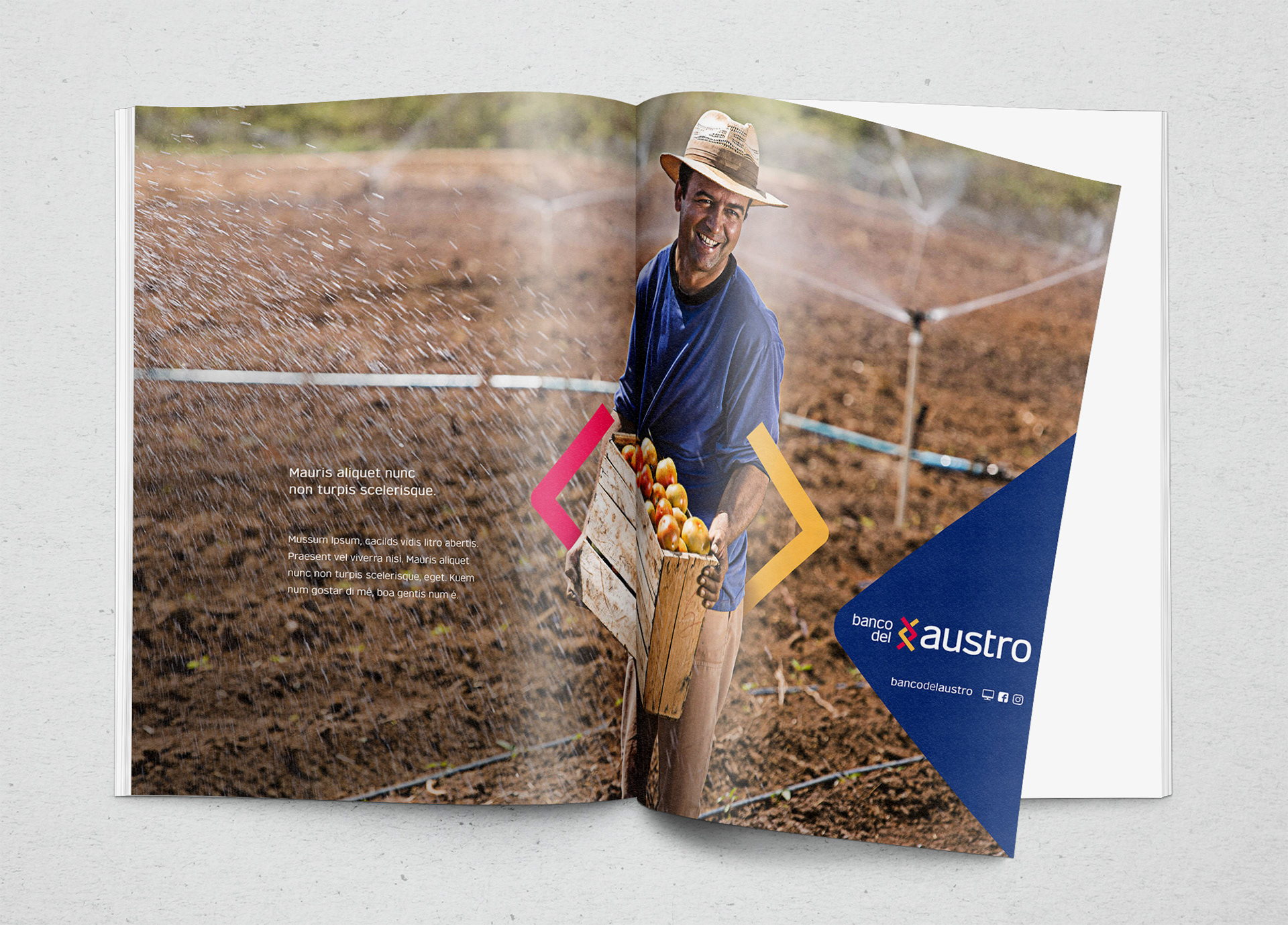
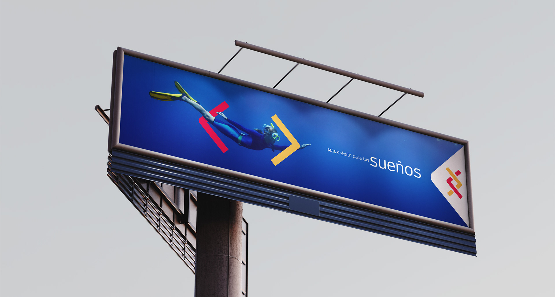
• New graphics: two bold, intertwined arrows symbolizing direction and movement
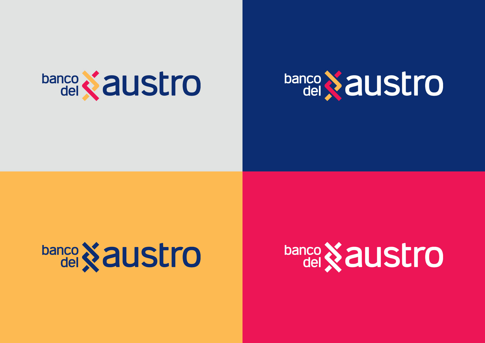
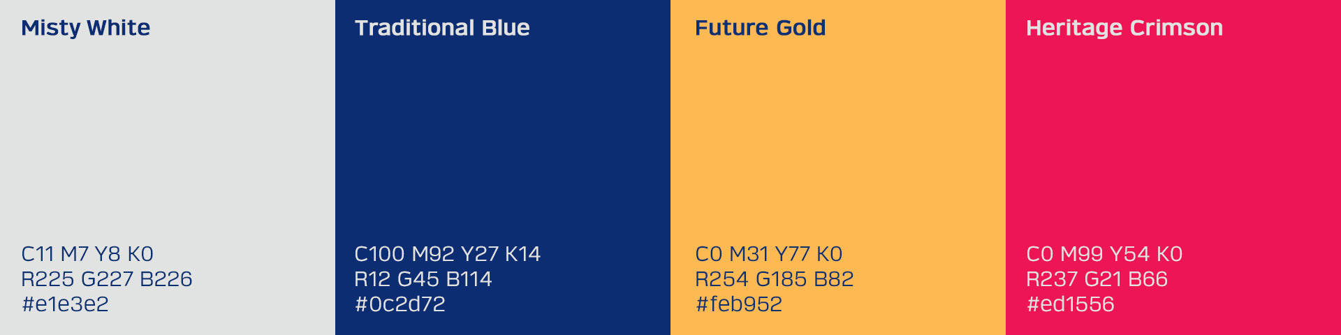
• New colors: Cuenca’s red and gold to balance past and future
• New typography: lowercase blue text to convey trust and approachability
• Bold positioning: emphasis on austro to highlight the southern region and its people
Overall, a modern identity that bridges heritage and progress.
The chosen design features:
• New graphics: two bold, intertwined arrows symbolizing direction and movement
• New colors: Cuenca’s red and gold to balance past and future
• New typography: lowercase blue text to convey trust and approachability
• Bold positioning: emphasis on austro to highlight the southern region and its people
Overall, a modern identity that bridges heritage and progress.
The Brand System
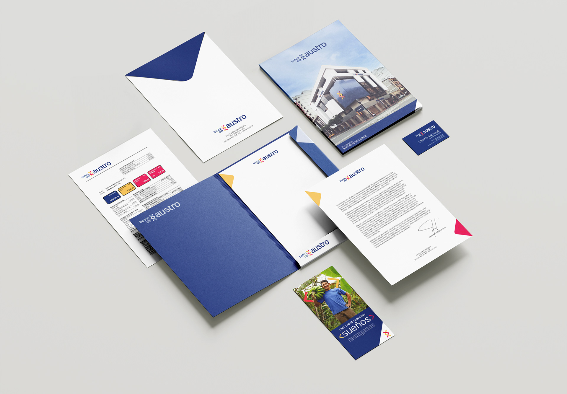
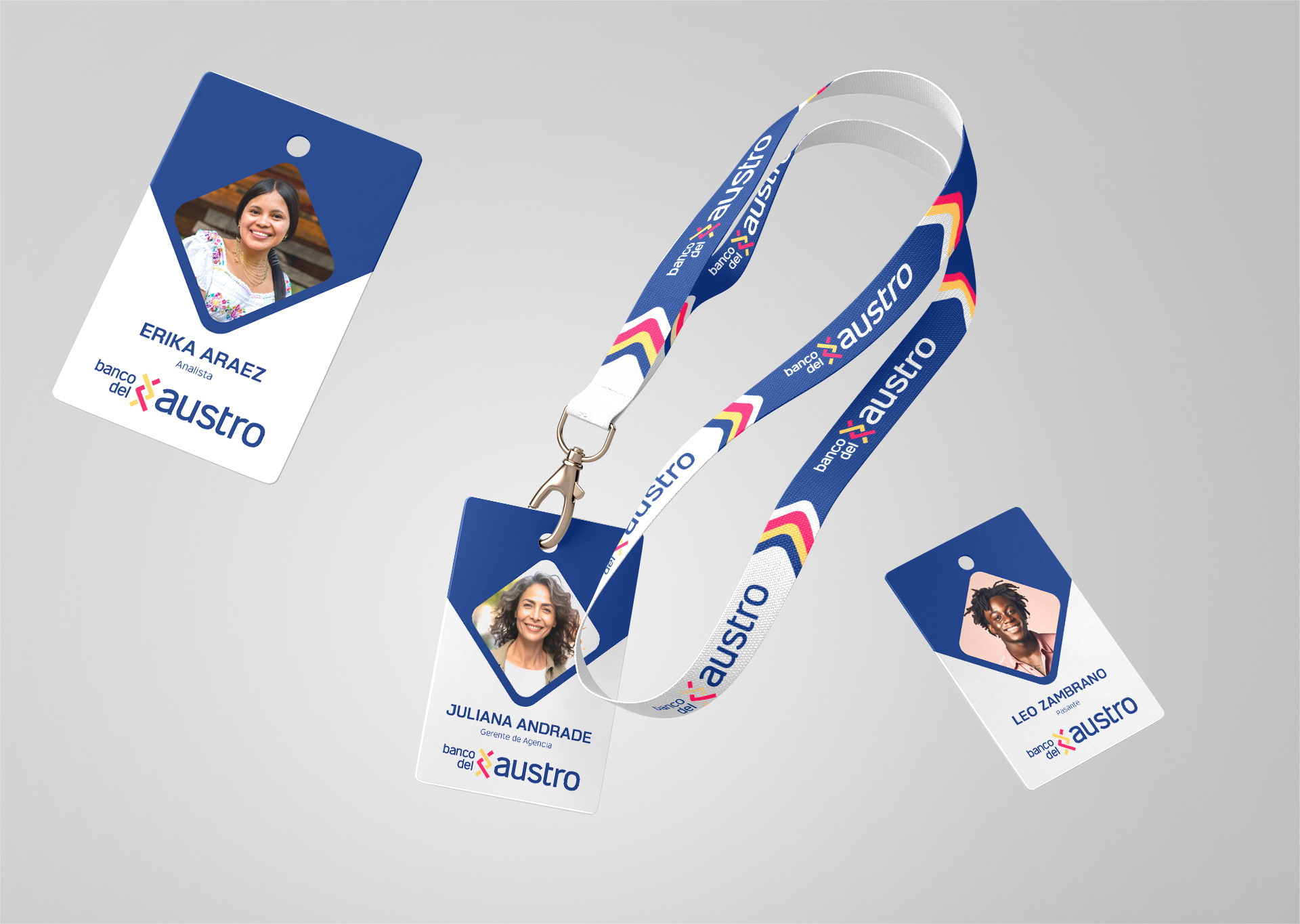
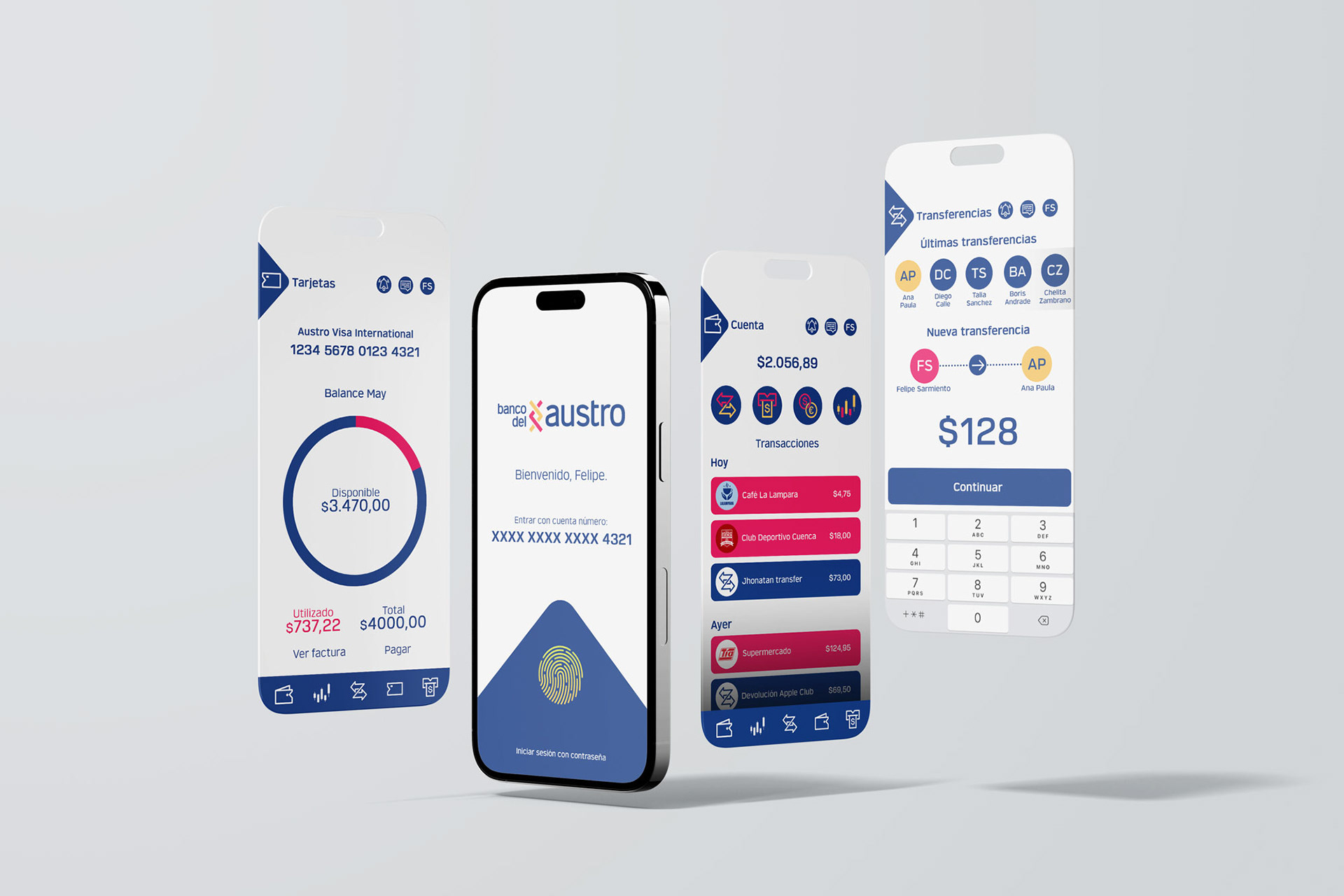
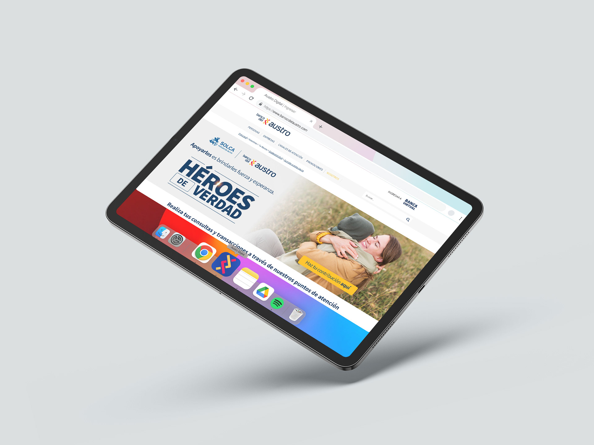
We developed a comprehensive brand manual with clear guidelines. The identity was applied to a wide range of assets, from merchandising and corporate materials to digital interfaces and social media. These elements were crafted to expand creative possibilities and ensure consistency and impact across all platforms.
We developed a comprehensive brand manual with clear guidelines. The identity was applied to a wide range of assets, from merchandising and corporate materials to digital interfaces and social media. These elements were crafted to expand creative possibilities and ensure consistency and impact across all platforms.
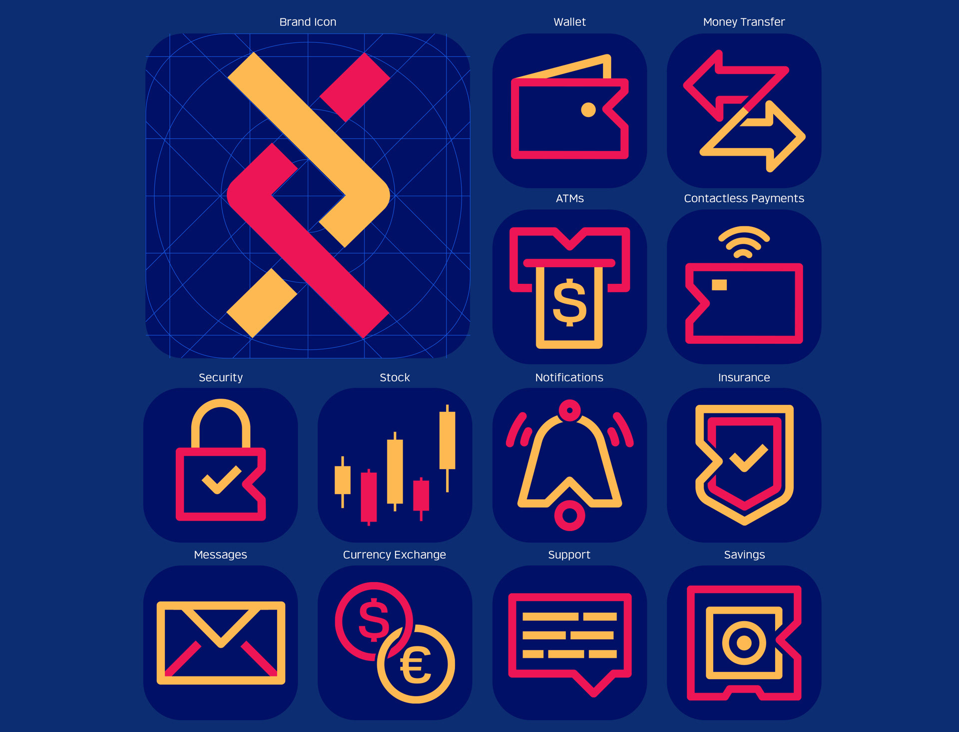
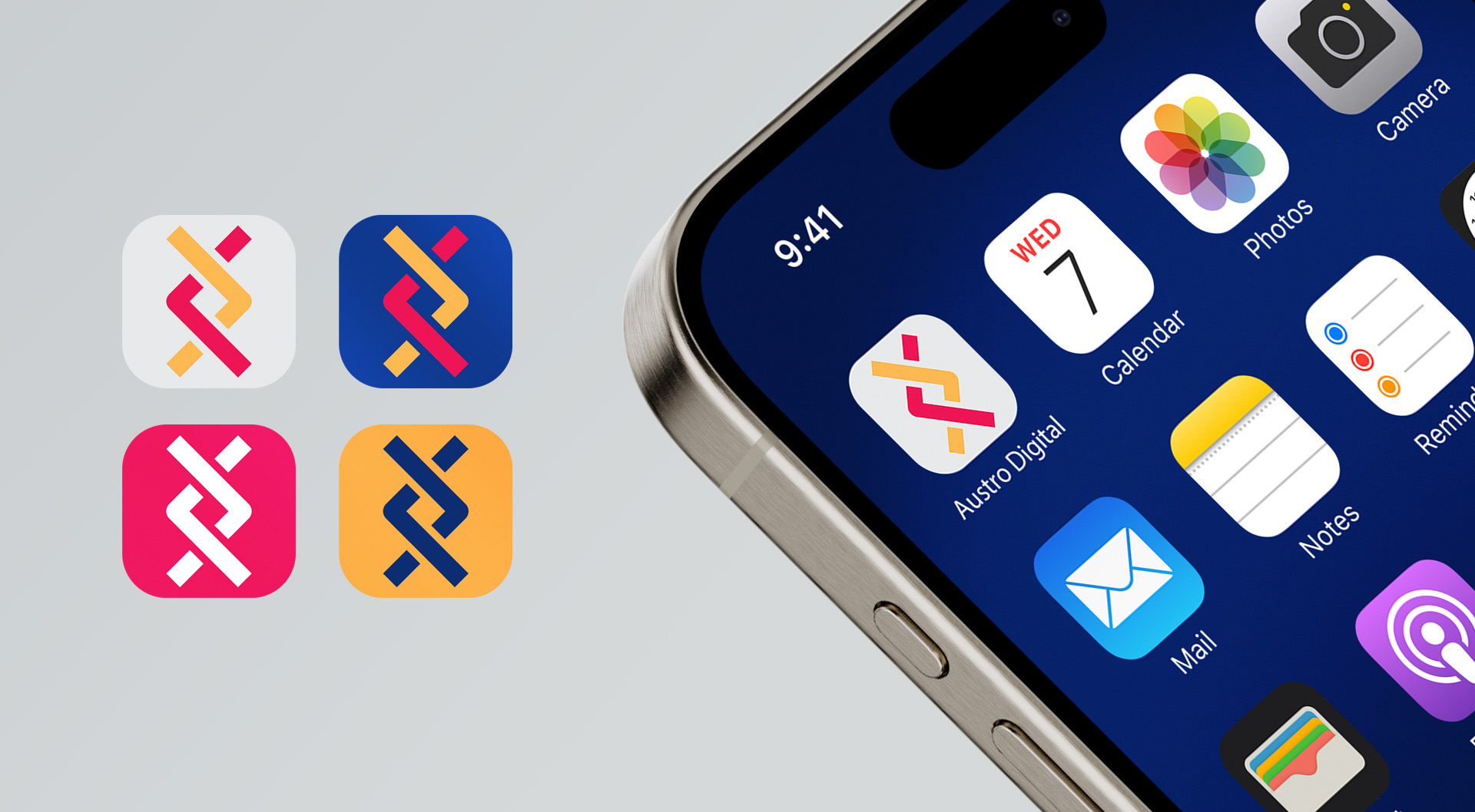
The Iconography
The Manifesto (please, check subtitles options)
Video unveiling the new brand for the public, capturing Banco del Austro’s journey and commitment to evolving while remaining connected to its roots.
Video unveiling the new brand for the public, capturing Banco del Austro’s journey and commitment to evolving while remaining connected to its roots.
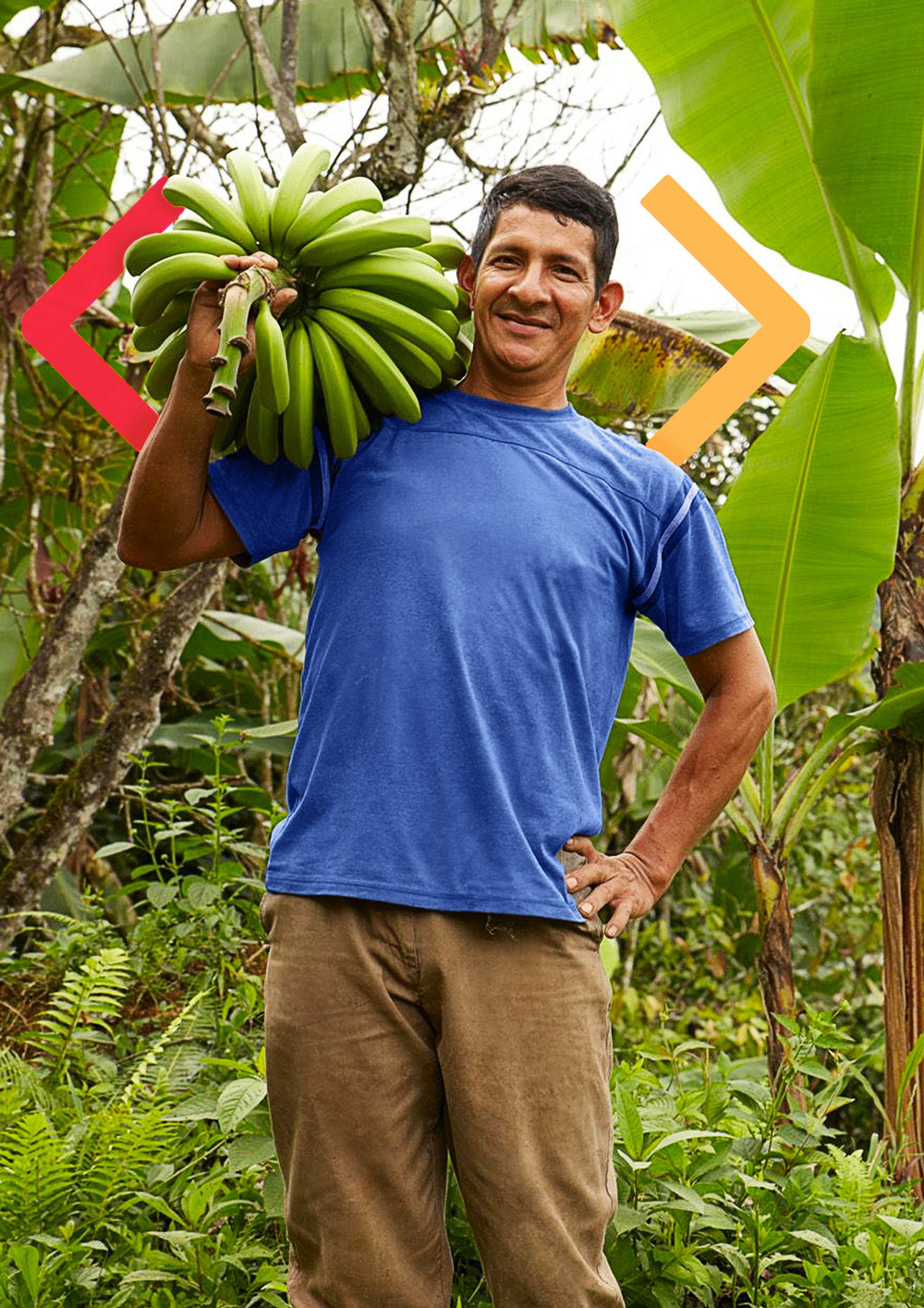
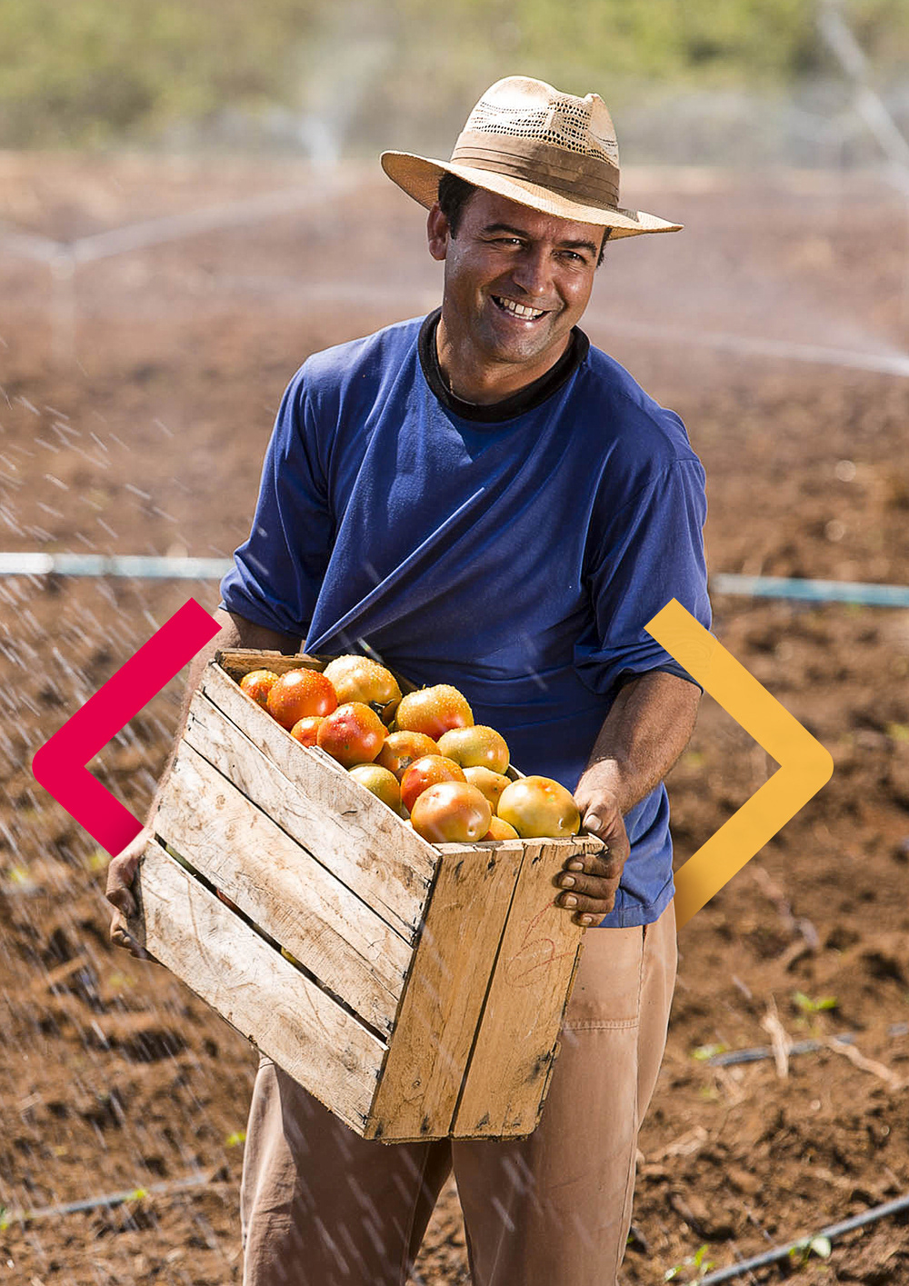
The Arrows
Beyond the logo, the intertwined arrows extend into layouts as dynamic graphic elements; one symbolizing the past, the other the future. Together, they form a visual narrative that connects heritage with future aspirations.

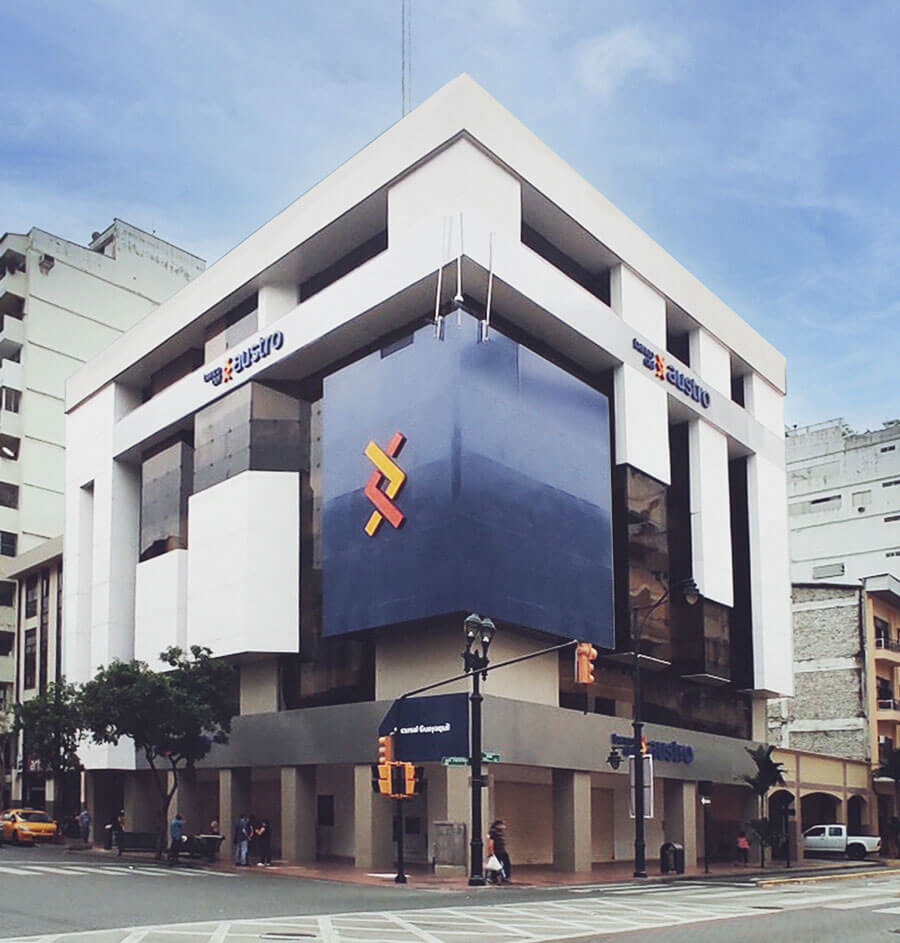
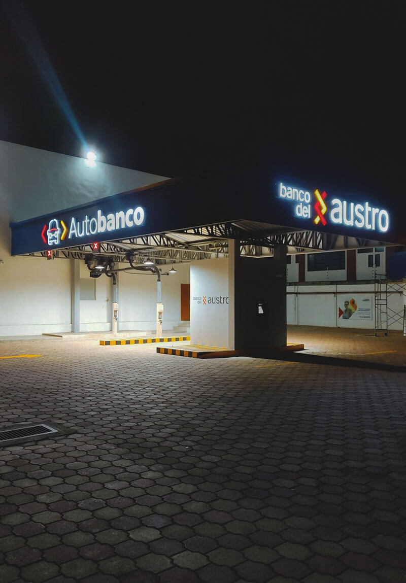
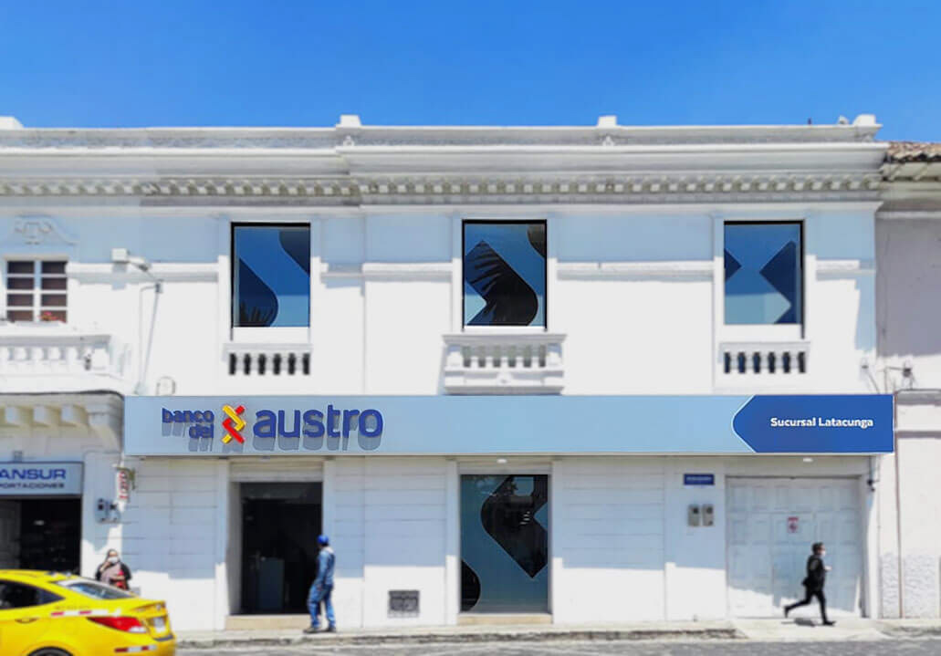
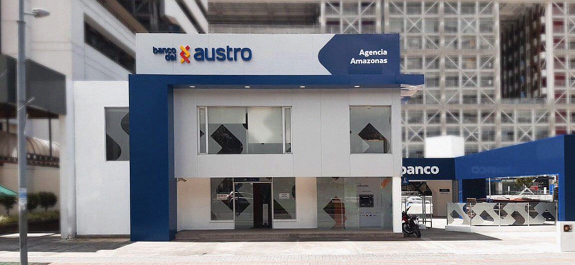
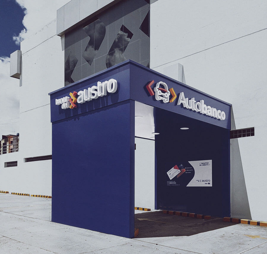
Offline Applications


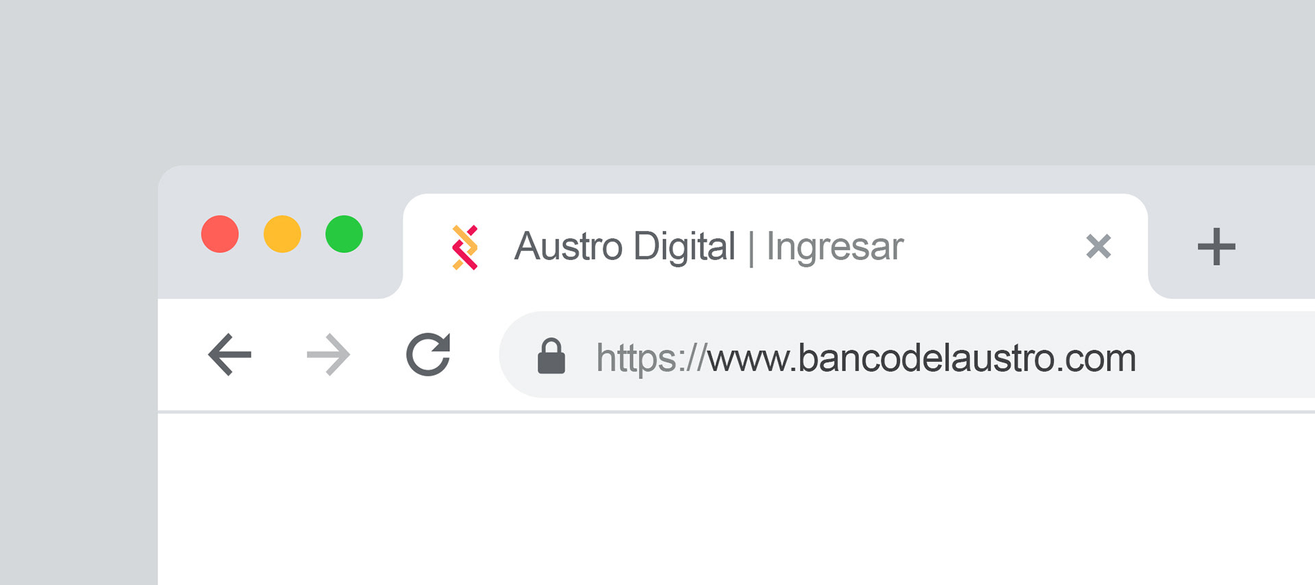
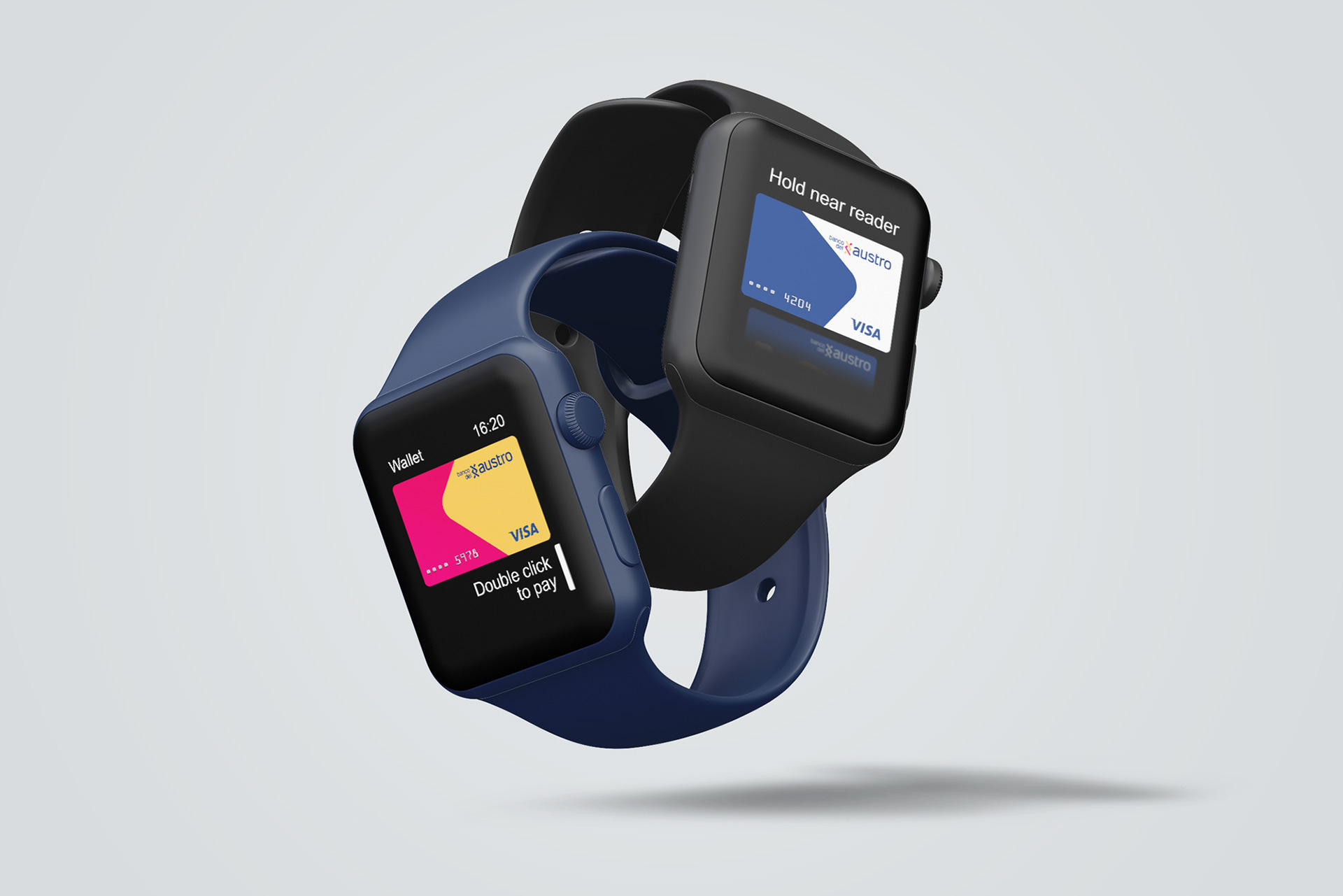
Online Applications


The Agencies

Club Deportivo Cuenca Jersey's
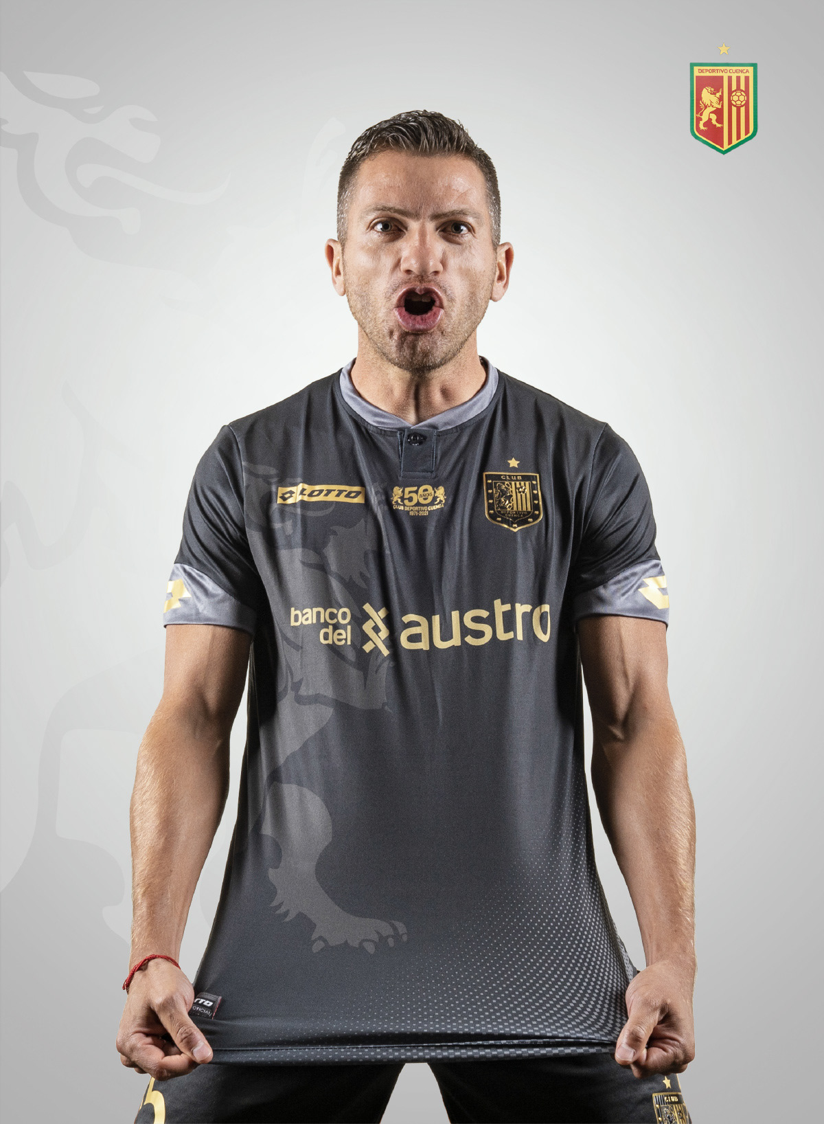

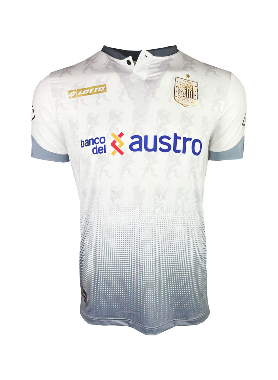

Partido Cuenca, 2022


The Result
This rebrand positioned Banco del Austro as a modern institution rooted in heritage, with a new logo that strengthens its identity and bridges tradition with progress.
--
• • •
Banco del Austro Client
Y&R Ecuador Agency
Germán Andrade Creative Director / Brand Strategy
Marcelo Feitosa / Leonardo Zambrano Art Direction / Design
Boris Calle / Christian Caceres Copywriting
Ana Maria Procel / Thalia Román / Mario Sanchez Account Executive
Titan Production Company
Israel Delgado / Alexander Places Film Direction
Ere Studio / Andrés Ruilova Photography
BAV Group Brand Consultancy
Señal X Branding Implementation